
Scientists estimate that there are about 10 million colors in the world. And if you’re trying to figure out your brand colors, you’ve probably spent way too much time scrolling through a few hundred of them. Is your brand powerful enough for a big, bold red? Or do you want people to feel calm and confident when they see your particular hue of blue? If you’re not sure where to start, a little brand color theory know-how can help get you started.
What makes brand colors so important?
Humans are hard-wired to see and respond to color. In fact, our brains process color before they can make sense of words or shapes. In the past, the ability to recognize colors helped us find food (ripe berries against green vines) and identify danger (brightly colored venomous critters or the flickering orange of fire). We’ve also used colors to show our group affiliations for centuries. Just think about how modern sports jerseys resemble medieval family crests.
Brand colors work for you in a few key ways:
Creating a mood
Brand colors have a huge impact on how people feel when they see or interact with your brand. Understanding how to put your brand colors to work can help you connect with your ideal audience!
For example, imagine you’re looking for a nail salon near you. When you start your online search, you find two options. The first brand’s website is full of neon pinks, bright blues, and punchy greens. The other one features lush pastel pinks and earthy neutrals.
What are a few words you might associate with each brand, just based on those color descriptions? Go ahead, we’ll wait. Ok, ready? In our experience, those colors likely have the following associations:
- Brand #1 – young, energetic, disruptive, playful, and edgy
- Brand #2 – grounded, relaxed, serene, and warm
Without knowing anything else about these brands—business names, taglines, services, core values—the colors impact how you feel when you interact with them.
Increasing brand recognition
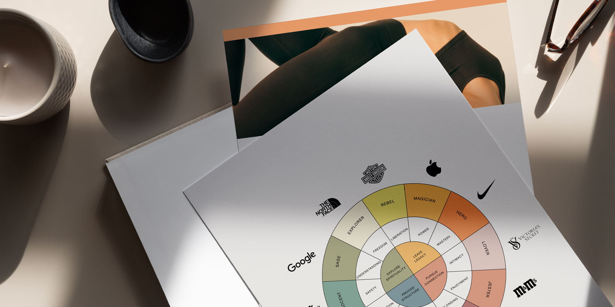
McDonald’s red and gold. Tiffany’s blue. Home Depot orange. Even a simple white apple logo against a black background. Some brands are so deeply connected with their colors that it’s impossible to separate them. Why does it matter? Well, it’s been proven over and over that consistent brands are more recognizable brands. In fact, one study found that color can help increase brand recognition by 80% and that recognition translates to more sales.
Impacting buyer decisions
Why do you choose one brand of toothpaste over another? Well, research suggests colors play a big role in your decision-making. Over 90% of people base their buying decisions on visual factors and 60-90% judge a product based on colors alone. But the chosen colors don’t just need to stand apart from the competition, they also need to accurately reflect the brand’s personality.
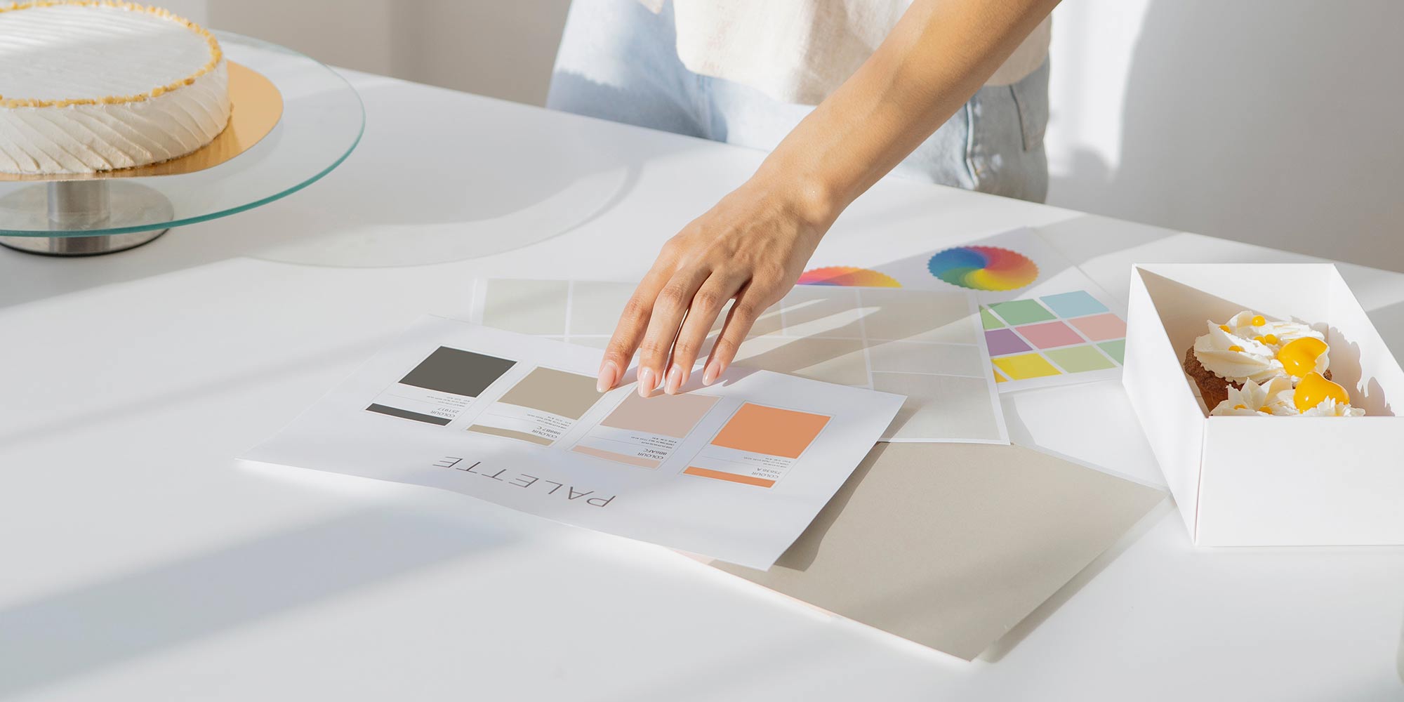
So, what is brand color theory?
Brand color theory digs into the psychology behind different brand colors. This often means doing a deep dive on how color perception and how it’s shaped by our unique experiences and cultural beliefs. According to current brand color theory, there are two basic types of color associations: natural association and social or psychological associations.
In natural association, we link colors with their occurrence in the world around us. For example, the limitlessness of a bright blue sky, ripeness of a red tomato, or associating green with nature. Social (AKA psychological) associations, by contrast, are shaped by how, when, and where we’re raised. The social meaning is what we’ve been taught to associate with different colors. For example, in China, red often symbolizes luck and happiness while in the United States it may be associated with passion, or strength.
Understanding brand color theory can help you build a strong, recognizable brand. But it’s just as important to understand your brand’s identity and the audience you’re trying to connect with. Even more important, you need a deep understanding of how you want your audience to feel when they interact with your brand.
Brand color theory in action:
Building Illimitee’s Brand Palette
Illimitee is a high-end online fitness platform committed to igniting the athlete inside everyone. They aim to inspire real change in people’s lives through specialized classes, expert fitness coaching, and personalized training programs. They want their customers to feel strong, powerful, and limitless. They also want their brand to feel exclusive, high end, and elevated. They also knew that they wanted to incorporate a phoenix in some way – a symbol that meant a lot to the owners and represented a new start for the brand as well as their fitness subscribers.
According to color theory, red evokes power and confidence while gold has direct ties to success, loyalty, and luxury. We chose those as our brand colors early in the branding design process. But deciding how to use them is where the fun began.
Through my research, I learned that the Phoenix is associated with the sun and rebirth, making it the perfect primary color for their logo and iconography. We introduced powerful red as an accent color, providing a perfect punch of color to their website, collateral, and visual presence.
Putting brand color theory to work
There’s a ton of information out there about color psychology and color brand theory. If you’re interested in learning more in order to DIY your brand colors, I highly recommend “The Secret Lives of Color,” a book by Kassia St. Clair that explores the cultural and social history of colors.
Here at Lunar Creative, we’re always digging into the latest theories and research to make color psychology work for you. For us, that means taking a 50,000 foot view of your industry, brand, product or services, and target audiences to discover brand colors that support your brand’s authentic expression.
Remember there’s more to your branding than brand colors
Choosing your brand colors is an important step in the brand design process. But it’s just one of many! Remember, every element of your branding needs to support your brand’s identity and tell that story. At Lunar Creative, we’re in the business of discovery and can take the guesswork out of bringing your brand’s identity together. Ready to get started? Get in touch to see if we’re a good fit!